Feast collection by ottolenghi
Expressive tableware made for sharing
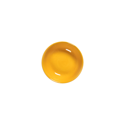
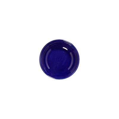
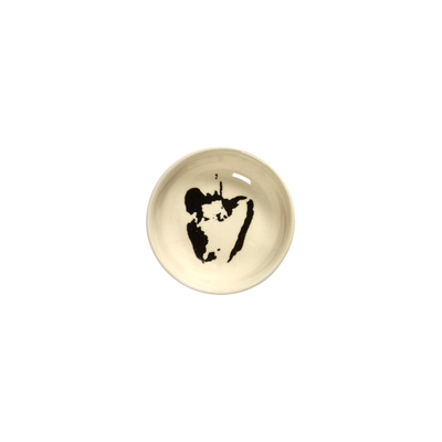
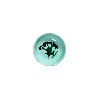
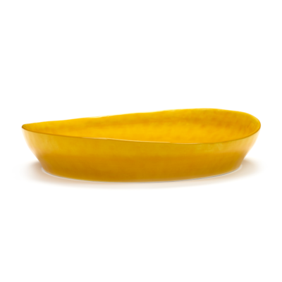
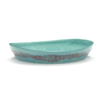
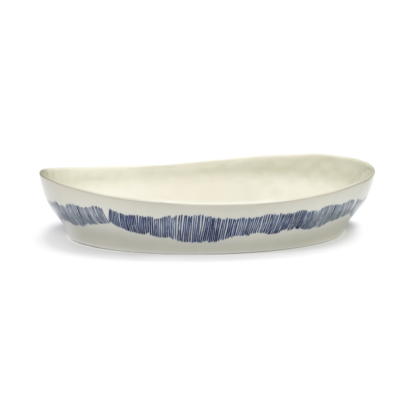
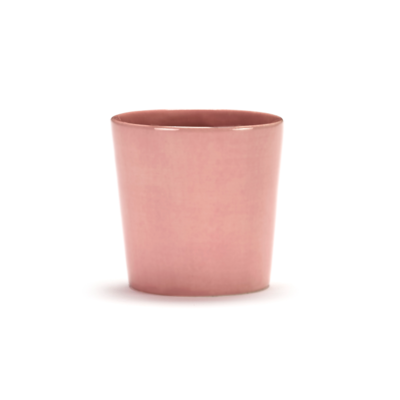
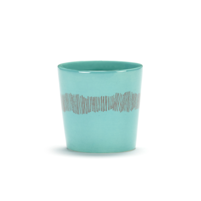
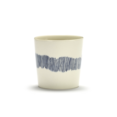
Ottolenghi FEAST is not quiet tableware. It brings colour, movement and a sense of abundance straight to the table. Created with Serax and artist Ivo Bisignano, the collection combines stoneware plates, bowls, serveware and tabletop pieces with painterly pattern, rounded form and a strong graphic pulse. The table feels fuller, looser and much more personal. That is what gives FEAST its place within designer dinnerware and colourful tableware.
A table collection made for passing, serving and mixing
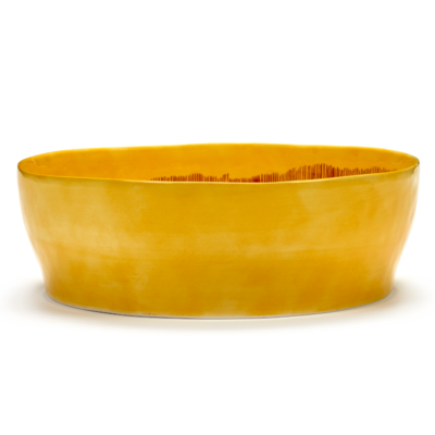
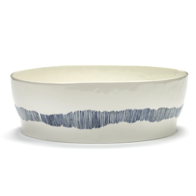
The logic behind FEAST starts with food that is shared. Large serving dishes, deep bowls and layered plates support a table where dishes move, colours interact and combinations stay open. That makes the collection especially strong for relaxed hosting and everyday dining with more visual energy. Within the wider market of tableware, Ottolenghi FEASTstands out because it encourages a table that feels active rather than staged.
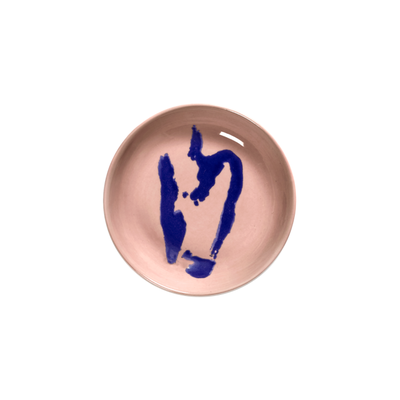
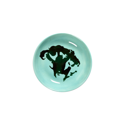
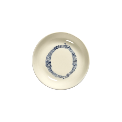
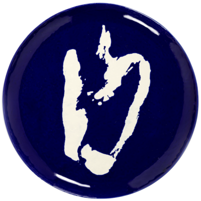
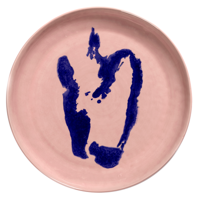
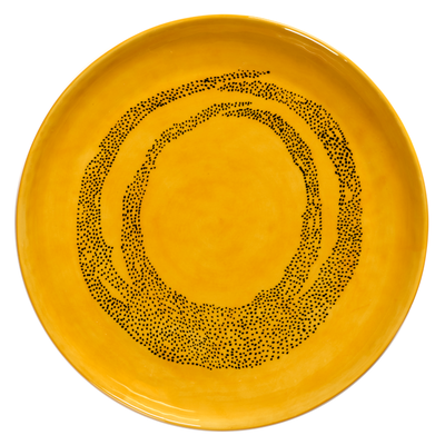
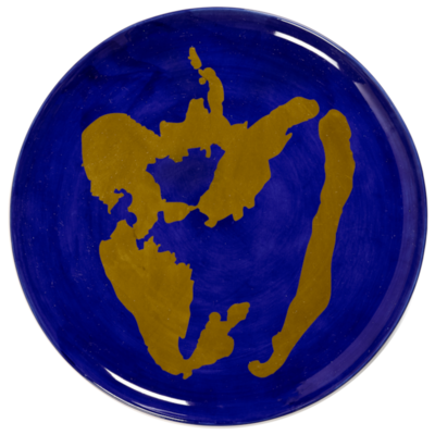
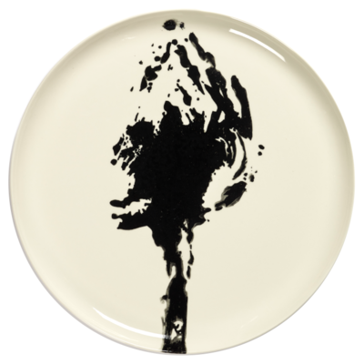
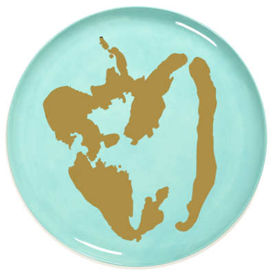
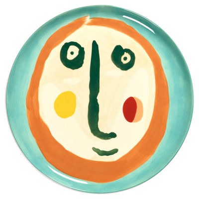
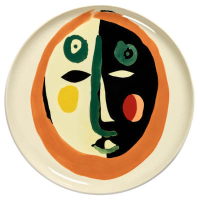
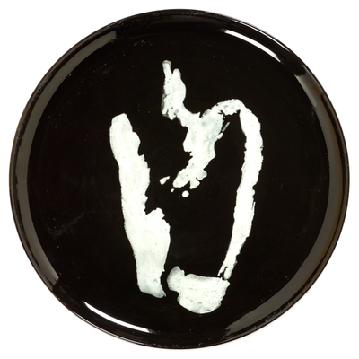
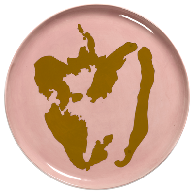
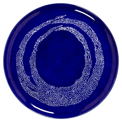
Graphic pattern as identity
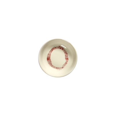
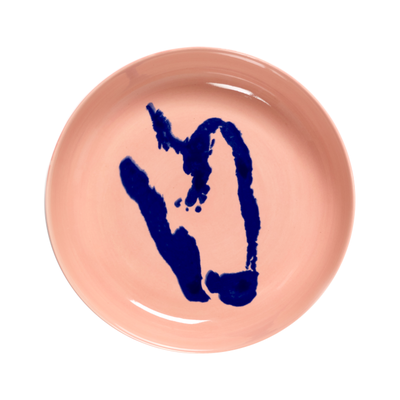
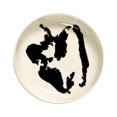
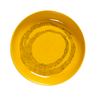
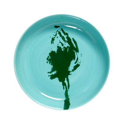
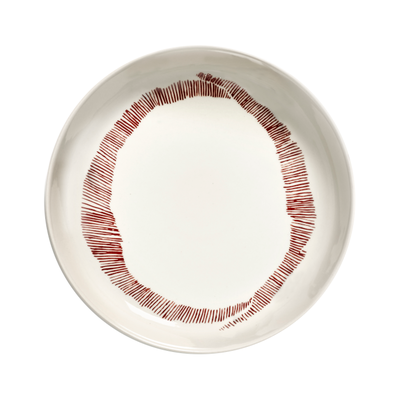
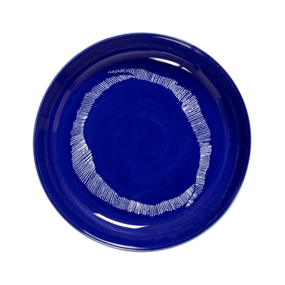
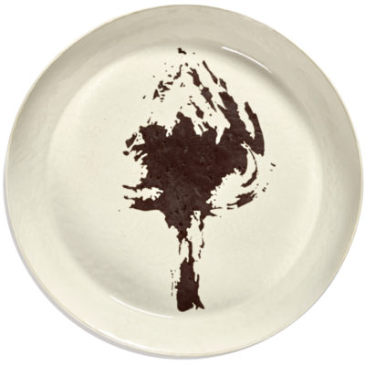
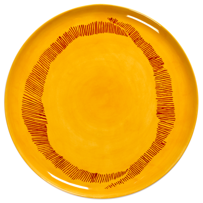
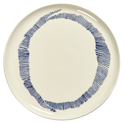
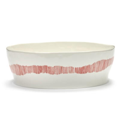
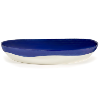
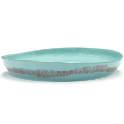
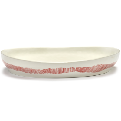
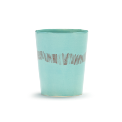
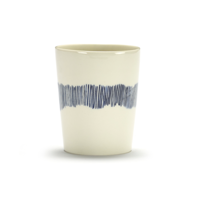
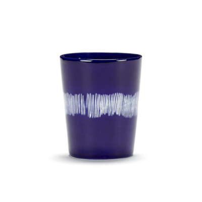
The collaboration with Ivo Bisignano gives FEAST a visual language that is instantly recognisable. The painted “O”, abstract vegetable motifs and loose brush gestures create rhythm across the collection. Pattern is not secondary here. It drives the personality of the piece. That gives designer plates, design bowls and expressive serveware a stronger decorative role without taking away from usability.
Hand-painted stoneware for everyday use
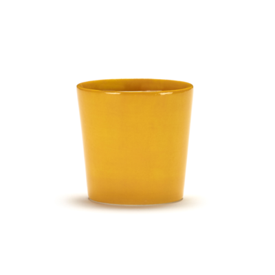
FEAST is made in high-fired stoneware, giving the collection the durability needed for real daily use. The hand-painted finish keeps every piece lively and visually distinct. This combination matters for SEO and for the customer alike: stoneware tableware remains one of the clearest category signals, but here it comes with a far stronger visual identity than standard dinnerware. Practical, yes. Generic, no.
Styling tips for FEAST tableware
FEAST works best when the table feels alive rather than overly controlled. Mixing colours and motifs is part of the identity of the collection and creates the generous, relaxed atmosphere it was designed for. A second approach is to choose two base colours and repeat them across plates, bowls and serving dishes for a table that still feels expressive but more balanced. A third option is to focus on one motif and build a stronger visual rhythm with repeated pattern, especially effective when combined with plain linens or neutral glassware.