Midnight flowers collection by marni x serax
Hand-illustrated porcelain tableware with a botanical twist
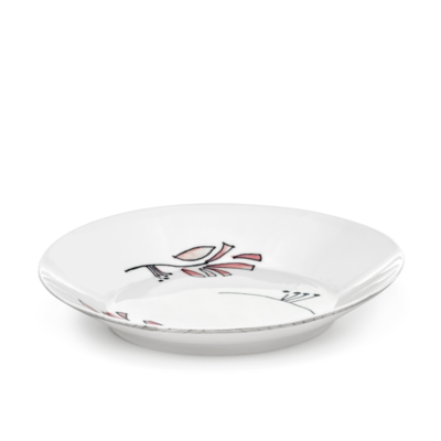
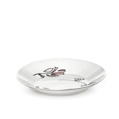
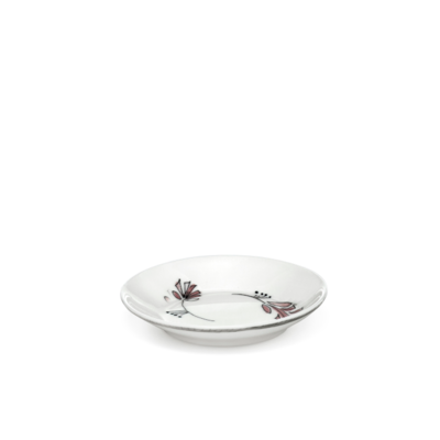
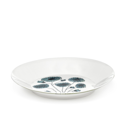
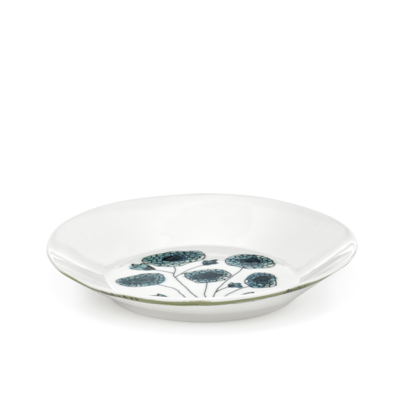
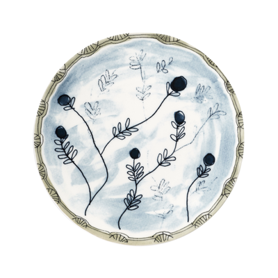
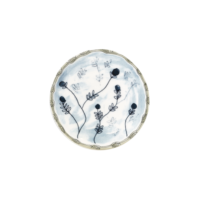
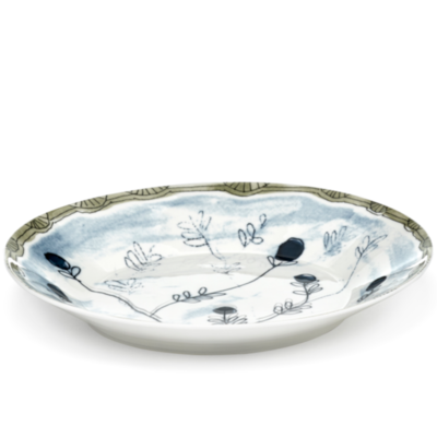
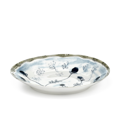
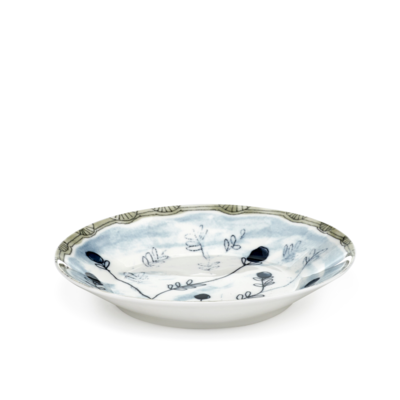
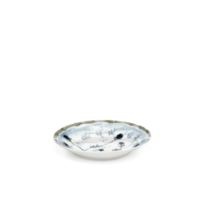
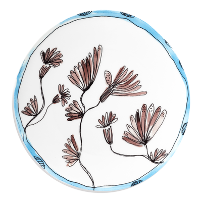
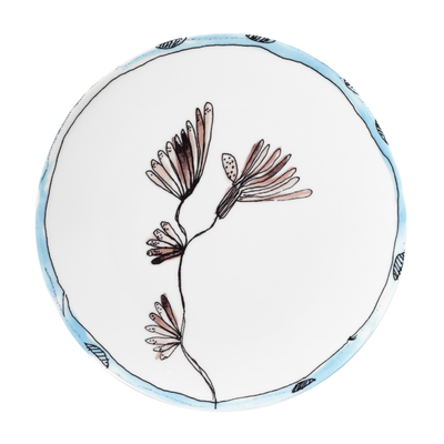
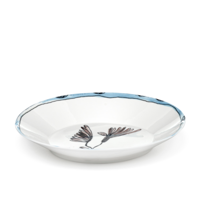
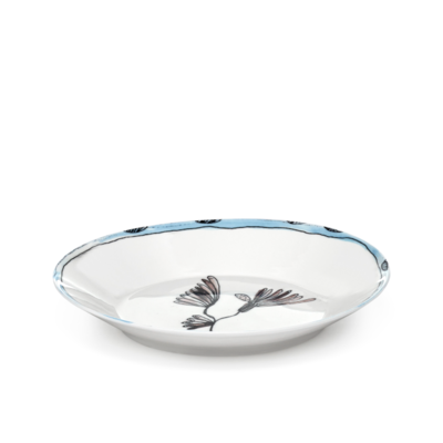
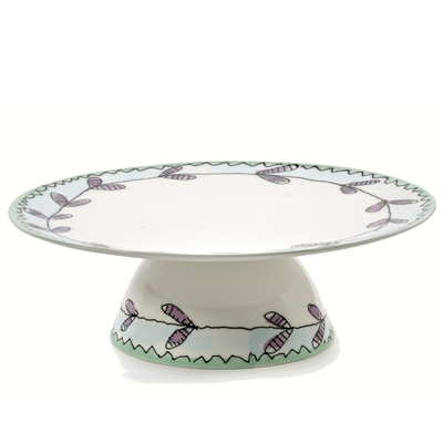
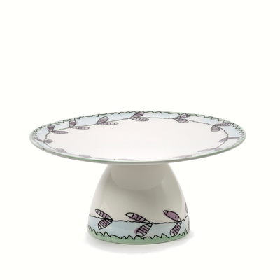
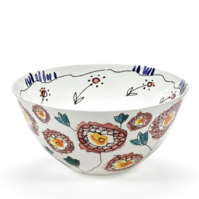
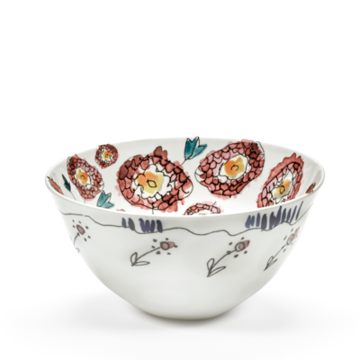
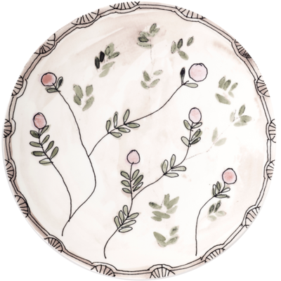
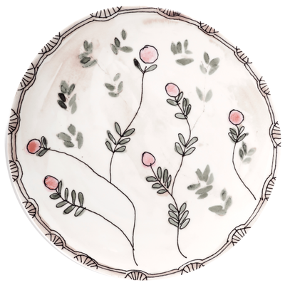
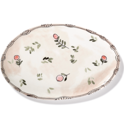
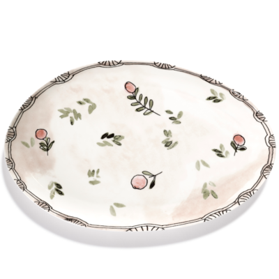
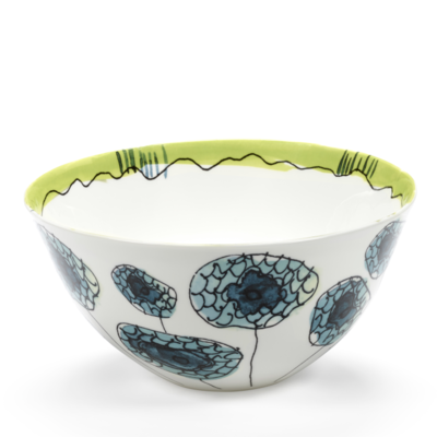
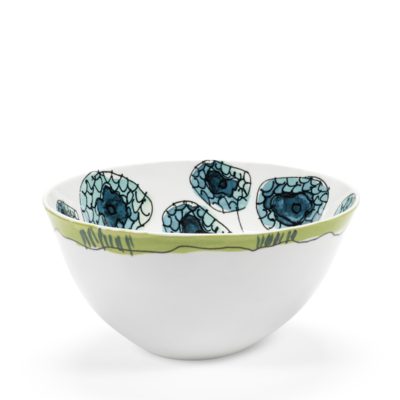
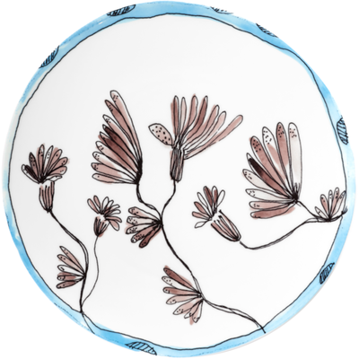
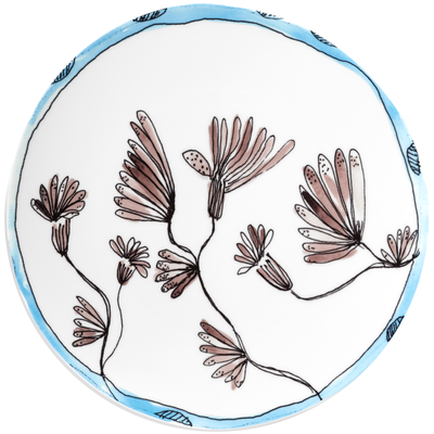
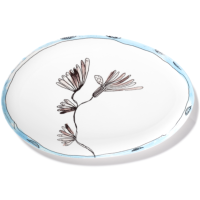
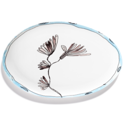
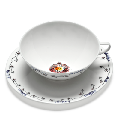
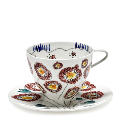
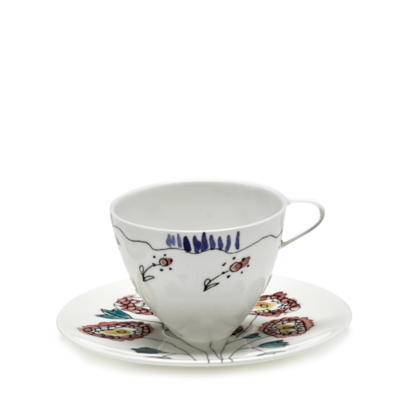
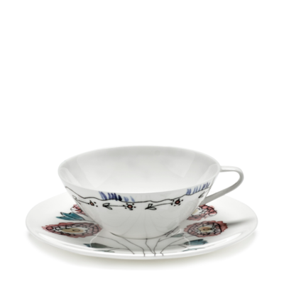
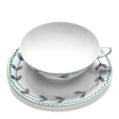
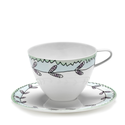
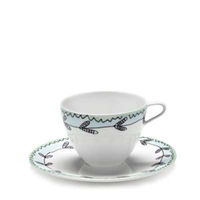
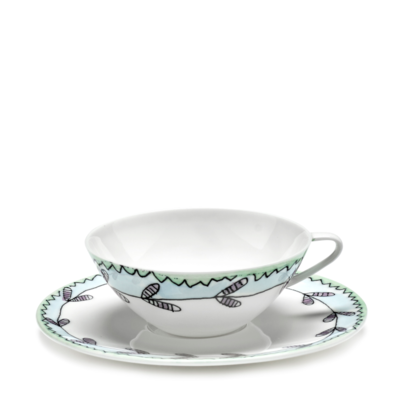
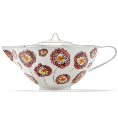
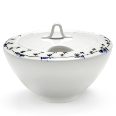
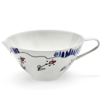
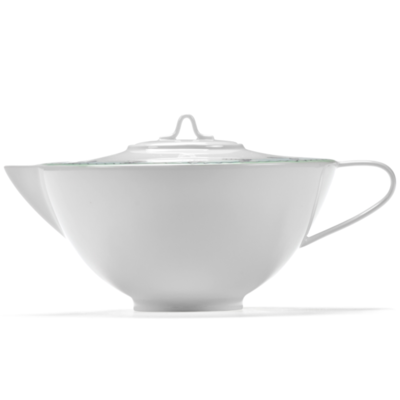
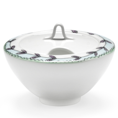
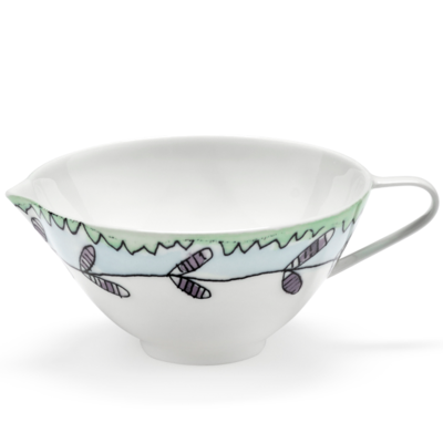
Midnight Flowers brings the world of Marni straight to the table. Created with Serax and imagined by Francesco Risso, the collection includes 120 porcelain pieces — from plates and bowls to cups, saucers and teapots — all shaped with a slightly offbeat elegance. The hand-illustrated floral motifs and gently asymmetrical forms give the collection a playful energy that feels instantly recognisable.
A porcelain collection where the illustration leads
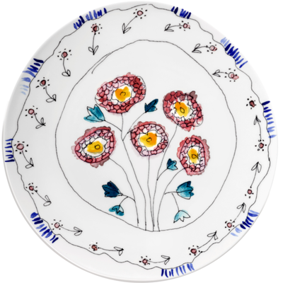
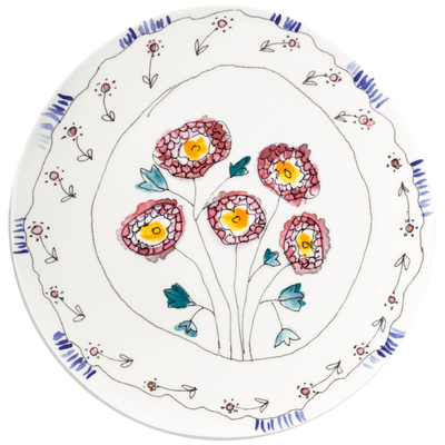
In Midnight Flowers, the decoration is not an extra layer. It is the starting point. The botanical drawings designed by Francesco Risso carry the same visual freedom that defines Marni, but on porcelain plates, bowls and tea pieces instead of fabric. That gives the collection a very different position from more classic porcelain tableware: it feels more expressive, more spontaneous and much more personal.
Colour is part of the identity
The palette matters just as much as the motif. Mauve, teal, rose and touches of lime give Midnight Flowers its own rhythm and help each piece hold its place on the table. The result is a collection that works especially well for anyone drawn to colourful tableware, designer dinnerware and settings that feel less formal. The table looks composed, but never rigid.
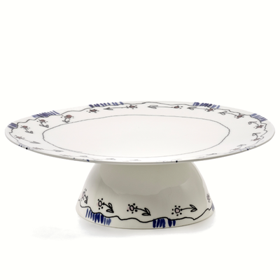
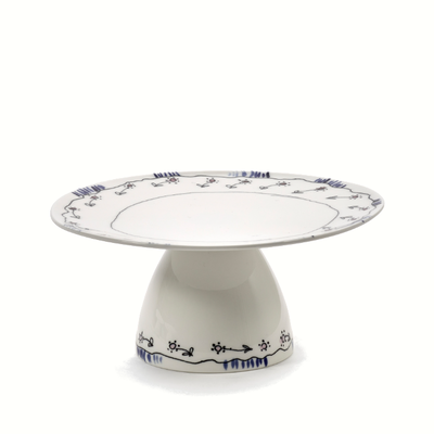
Slightly asymmetrical forms keep the collection alive
One of the strongest elements in Midnight Flowers is the shape. The plates, dishes, bowls, cups and teapots all use slightly asymmetrical forms that bring out the hand-touched quality of the porcelain. This makes the collection especially easy to mix across sizes, motifs and colours. It feels designed, but never too controlled — which is exactly where the collection gets its character.
How to style your table with Midnight Flowers
With Midnight Flowers, one easy way to build the table is to start with a single floral motif on the larger plates, then bring in more colour through bowls, cups or a teapot. Mauve and rose keep the table softer, while teal and a touch of lime create more contrast.
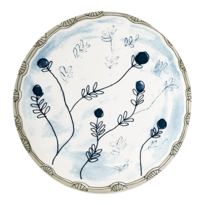
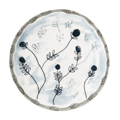
Set against a cleaner base such as Piet Boon Base, the decoration feels sharper and more pronounced. Paired with Perfect Imperfection by Roos Van de Velde, the collection brings more colour and a stronger visual contrast to the softer, organic shapes. This keeps the table expressive without making it feel overloaded.